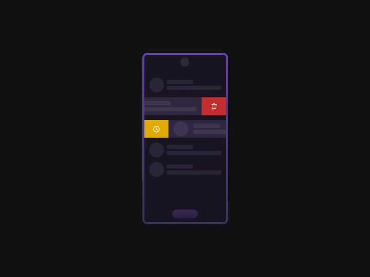
Have you ever been curious about how swipe gestures work in Android apps? Good news! You can create the same features without using any extra libraries or complicated code. In this guide, we'll not only show you how to create Gmail-style swipe gestures, but also how to add drag-and-drop actions just like in the image below.
I won't go into detail on the basics, such as the item XML and Adapter classes. You can find the complete example in the source code provided at the end of this post. Instead, I'll focus on explaining the core concepts of swipe gestures and drag-and-drop action.
Swipe gestures
Let's start with the essentials. We'll need the device's width and height, icon references, color, and a basic list. Additionally, we've created an extension function that we'll use frequently to convert pixel dimensions into dynamic pixels (dp) for better adaptability.
class MainActivity : AppCompatActivity() {

    // Declare two variables: dragHelper and swipeHelper, both of type ItemTouchHelper
    private lateinit var dragHelper: ItemTouchHelper
    private lateinit var swipeHelper: ItemTouchHelper

    override fun onCreate(savedInstanceState: Bundle?) {
        super.onCreate(savedInstanceState)
        setContentView(R.layout.activity_main)

        // Get the device's width and height in dynamic pixels (dp)
        val displayMetrics: DisplayMetrics = resources.displayMetrics
        val height = (displayMetrics.heightPixels / displayMetrics.density).toInt().dp
        val width = (displayMetrics.widthPixels / displayMetrics.density).toInt().dp

        // Get the delete and archive icons from resources
        val deleteIcon = resources.getDrawable(R.drawable.ic_outline_delete_24, null)
        val archiveIcon = resources.getDrawable(R.drawable.ic_outline_archive_24, null)

        // Find the RecyclerView with the ID rv_list
        val rvList = findViewById<RecyclerView>(R.id.rv_list)

        // Set up the colors for delete and archive actions
        val deleteColor = resources.getColor(android.R.color.holo_red_light)
        val archiveColor = resources.getColor(android.R.color.holo_green_light)

        // Create a list of strings and initialize our custom ItemAdapter with the list
        val list = arrayListOf<String>().apply {
            for (i in 0..100) {
                add("Item $i")
            }
        }
        val adapter = ItemAdapter(this, list)

        // Set the adapter for our RecyclerView
        rvList.adapter = adapter

        // Define swipe helper here
    }

    // Extension property for Integers to convert them into dp using the TypedValue class
    private val Int.dp
        get() = TypedValue.applyDimension(
            TypedValue.COMPLEX_UNIT_DIP,
            toFloat(), resources.displayMetrics
        ).roundToInt()
}
With the basics in place, let's move on to the exciting part. We've already declared our swipe helper earlier; now it's time to add some code to make it work.
swipeHelper = ItemTouchHelper(object : ItemTouchHelper.SimpleCallback(
            0,
            ItemTouchHelper.LEFT or ItemTouchHelper.RIGHT
        ) {
            //more code here
        })
In the code, we initialize ItemTouchHelper with an object of the same class. It requires two parameters: dragDirs and swipeDirs. We set dragDirs to 0 to keep the swipe logic and drag logic separate. As for swipeDirs, we want the item to be swipeable from both sides, allowing us to provide different functionalities for different directions, depending on your use case.
At this point, the IDE will show an error and prompt you to override two methods: onMove() and onSwiped().
Let's listen to the IDE and override these two methods.
override fun onMove(
    recyclerView: RecyclerView,
    viewHolder: RecyclerView.ViewHolder,
    target: RecyclerView.ViewHolder
) = true

override fun onSwiped(viewHolder: RecyclerView.ViewHolder, direction: Int) {
    val pos = viewHolder.adapterPosition
    list.removeAt(pos)
    adapter.notifyItemRemoved(pos)

    Snackbar.make(
      findViewById(R.id.ll_main),
    if (direction == ItemTouchHelper.RIGHT) "Deleted" else "Archived",
    Snackbar.LENGTH_SHORT
    ).show()
}
The onMove() method isn't important for swipe logic, while onSwiped() is called after the user has completely swiped the item. Inside onSwiped(), you can make an API call, delete a data entry or room, or show an alert dialog. In this example, we're removing the item from the list and notifying the adapter. You can also check the direction in which the user swiped using the direction parameter, as demonstrated in the Snackbar function.
Don't forget to attach the helper to the RecyclerView as shown below:
swipeHelper.attachToRecyclerView(rvList)
At this point, your swipe will work as expected but there’s something missing right? Ah, yes! Where’s the background you might ask, yeah we’re on it.
Let's override the onChildDraw() method, which provides several parameters like
canvas, the amount of swipe done in the horizontal and vertical direction, the viewHolder
instance, etc. We'll use these parameters to draw icons and colors while swiping
in both the left and right directions.
// Override the onChildDraw() method
override fun onChildDraw(
canvas: Canvas,
recyclerView: RecyclerView,
viewHolder: RecyclerView.ViewHolder,
dX: Float,
dY: Float,
actionState: Int,
isCurrentlyActive: Boolean
) {
// 1. Set the background color based on the swipe direction
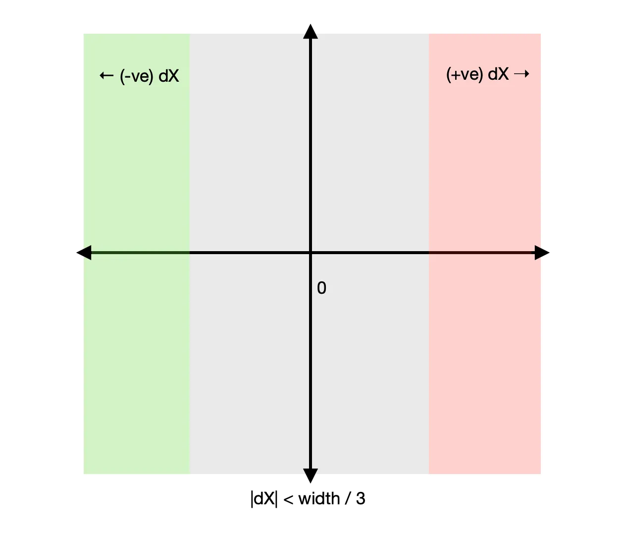
when {
abs(dX) < width / 3 -> canvas.drawColor(Color.GRAY)
dX > width / 3 -> canvas.drawColor(deleteColor)
else -> canvas.drawColor(archiveColor)
}
// 2. Set the bounds for the icons
val textMargin = resources.getDimension(R.dimen.text_margin).roundToInt()
deleteIcon.bounds = Rect(
textMargin,
viewHolder.itemView.top + textMargin + 8.dp,
textMargin + deleteIcon.intrinsicWidth,
viewHolder.itemView.top + deleteIcon.intrinsicHeight + textMargin + 8.dp
)
archiveIcon.bounds = Rect(
width - textMargin - archiveIcon.intrinsicWidth,
viewHolder.itemView.top + textMargin + 8.dp,
width - textMargin,
viewHolder.itemView.top + archiveIcon.intrinsicHeight + textMargin + 8.dp
)
// 3. Draw the appropriate icon based on the swipe direction
if (dX > 0) deleteIcon.draw(canvas) else archiveIcon.draw(canvas)
// Call the superclass implementation of onChildDraw()
super.onChildDraw(
canvas,
recyclerView,
viewHolder,
dX,
dY,
actionState,
isCurrentlyActive
)
}
The code might seem a bit complex at first glance, so let's break it down step by step. In the first part, we're setting the canvas' background color based on how much the user has swiped. Here's a clearer explanation of how we change the color based on the dX value:
- When
dX < (deviceWidth / 3)ordX < (-deviceWidth / 3), we show a gray color. We can simplify this by checking if the absolute value ofdXis less than(deviceWidth / 3). - If
dX > (deviceWidth / 3), we show a RED color (represented by thedeleteColorvariable). - In all other cases (i.e., when the user swipes left and
dXis less thandeviceWidth / 3), we show a GREEN color (represented by thearchiveColorvariable).
This approach allows us to change the background color depending on how far the user has swiped and the direction of the swipe.
The result of this code will be something like this.
Great, we're halfway through implementing the icon backgrounds. Now, let's put the icons in their proper positions. For a left-to-right swipe, we'll display a Trash can icon, and for a right-to-left swipe, we'll display an Archive icon. In step 2 of the code snippet, we've set the bounds for both icons.
The Rect(...) object takes four parameters: left, top, right, and bottom. These are the four points we need to define to position the icon. The additional 16dp and 8dp in the vertical coordinates account for the layout padding and drag icon padding, which are 16dp and 8dp, respectively.
Keep in mind that Rect(...) takes coordinates, not directional margins. To print the icons, we define the coordinates from all four directions.
Lastly, we check if dX is positive; if so, we draw the Trash can icon; otherwise, we draw the Archive icon. With these steps completed, you'll see the icons when swiping from either side of the view.
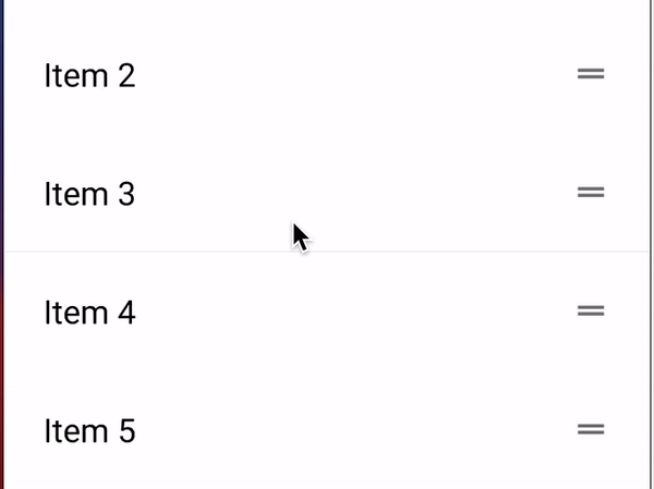
Drag and drop gestures
Implementing drag and drop gestures is similar to swipe gestures. However, for drag and drop, we specify the dragDirs as ItemTouchHelper.UP and ItemTouchHelper.DOWN, and swipeDirs as 0. If you're using a grid layout instead of a linear one, you can specify dragDirs in all directions.
dragHelper = ItemTouchHelper(object : ItemTouchHelper.SimpleCallback(
    ItemTouchHelper.UP or ItemTouchHelper.DOWN, 0
) {
    // onMove() is called when the user drags an item
    override fun onMove(
        recyclerView: RecyclerView,
        viewHolder: RecyclerView.ViewHolder,
        target: RecyclerView.ViewHolder
    ): Boolean {
        // Increase the elevation of the dragged item to visually distinguish it
        viewHolder.itemView.elevation = 16F

        // Get the adapter positions of the dragged item and the target item
        val from = viewHolder.adapterPosition
        val to = target.adapterPosition

        // Swap the items in the data source and notify the adapter
        Collections.swap(list, from, to)
        adapter.notifyItemMoved(from, to)
        return true
    }

    // onSelectedChanged() is called when the drag action state changes
    override fun onSelectedChanged(viewHolder: RecyclerView.ViewHolder?, actionState: Int) {
        super.onSelectedChanged(viewHolder, actionState)
        // Reset the elevation of the item after the drag action is completed
        viewHolder?.itemView?.elevation = 0F
    }

    // onSwiped() is not used in drag and drop logic, so we leave it empty
    override fun onSwiped(viewHolder: RecyclerView.ViewHolder, direction: Int) = Unit
})
In this implementation, we utilize the onMove() method and leave the onSwiped() method empty. As we drag the item over other items, we swap the dragged item's position with the target position and notify the adapter about the moved items.
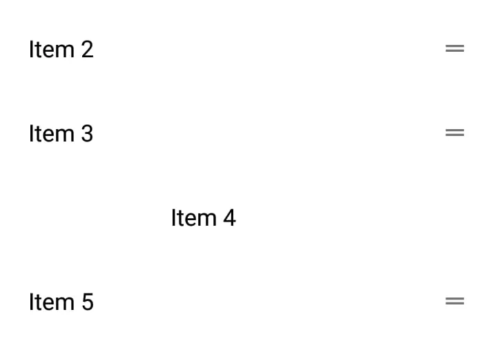
You can also modify the dragged item's appearance for a more '3D' effect. In this example, we increase the item's elevation to 16 units while it's being moved, and then set it back to 0 units in the onSelectedChanged() callback.
Don't forget to attach the dragHelper to the RecyclerView, just like we did with the swipeHelper. This ensures that the drag and drop functionality works as intended in your app.
dragHelper.attachToRecyclerView(rvList)
This method requires the user to long-press the item to activate the drag functionality, which is suitable for most cases. However, if you want to implement a drag-handle that doesn't require a long press and is always ready for dragging, you can achieve this easily with the help of a built-in function:
fun startDragging(holder: RecyclerView.ViewHolder) {
    dragHelper.startDrag(holder)
}
And now you have to call this function from your adapter’s onBindViewHolder() method like so.
override fun onBindViewHolder(holder: ItemViewHolder, position: Int) {
        holder.textView.text = list[position]

        holder.dragButton.setOnTouchListener { _, _ ->
            context.startDragging(holder)
            return@setOnTouchListener true
        }
}
Conclusion
And that’s it!
We've successfully learned how to incorporate swipe and drag-and-drop gestures into your Android app with ease, without depending on external libraries or overly complex code. We've guided you through the process of setting up the essential components, adding visual elements to swipe gestures, and implementing drag-and-drop functionality with a user-friendly drag handle.
You can refer to the source code
Happy Coding! ✨